New Sevenoaks station forecourt layout
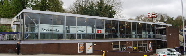
 The layout of the Sevenoaks station forecourt has been changed. John Morrison of the Sevenoaks Cycling Forum writes about the cyclists’ perspective:
I took a call from Southeastern to tell me that the latest round of works in the Sevenoaks station forecourt will at long last remove stray motorbikes and scooters from the cycle parking area and there will be some proper signage. We have been asking Southeastern about this since 2015 so it is welcome news, if belated.
Thanks to the Sevenoaks Rail Travellers Association for opening up a proper communications channel with Southeastern which delivered the new cycle racks in 2015 to replace the faulty ones installed by Network Rail in 2012.
Sevenoaks station is still far from idea for cyclists, who have to tangle with taxis and cars to access the racks, but further improvements in the main forecourt may be difficult.
If anyone has any feedback from cyclists using the station, please circulate it.
The racks on the Kippington side (Car Park 1) are usually full and it may be we should ask Southeastern to install another set and remove one or two car parking spaces. Anyone have any views on this?
Other changes in the new layout are a relocated drop-off zone that means customers have to cross incoming traffic to get to the station, and a revised queuing system for taxis.
If you have any comments on the new layout or the Kippington side facilities, whether from a cyclist perspective or not, please let us know here.
Given the constraints of the site, the revised layout is probably as good as it gets, short of major reconstruction. But it remains to be seen whether the new Drop Off arrangements will work as intended, and so far the evidence suggests that they won’t.
The main problem is that there’s no prohibition on dropping passengers off at the entrance ramp: by definition, the double yellow lines permit picking up and setting down. Red ‘No Stopping’ lines might have been better.
The main sign advertises the new Drop Off zone and is far better than its hopelessly unreadable predecessor. However, it’s still fatally flawed because it’s in the wrong place, becoming visible only after dropping someone off at the entrance ramp.