New Ticket Design: Is it more difficult to read and to understand?
 When I purchased tickets to Egham this month I noticed that the layout and font used on the tickets has changed. I now need to wear my reading spectacles to read what is printed on the tickets.
The new design of ticket makes it much more difficult to read:
- crowded lines of text
- the use of lower case for the key information (origin, destination and date)
- the use of a (even) smaller font for some information
- the unstructured layout in which key information cannot be seen as a glance.
Approximately one third of the ticket is now a blank space (space for advertising? we will see in time).
 We wonder whether the new design complies with the requirements of the Equality Act – or even whether the new design has been properly tested on real passengers.
We also wonder whether it has been tested on conductors who check tickets on trains – it is hard to believe that the information that they check at a glance is as easy to see.
What do you think of the new design? Do you find it more or less difficult to read, or to understand? Please let us know.
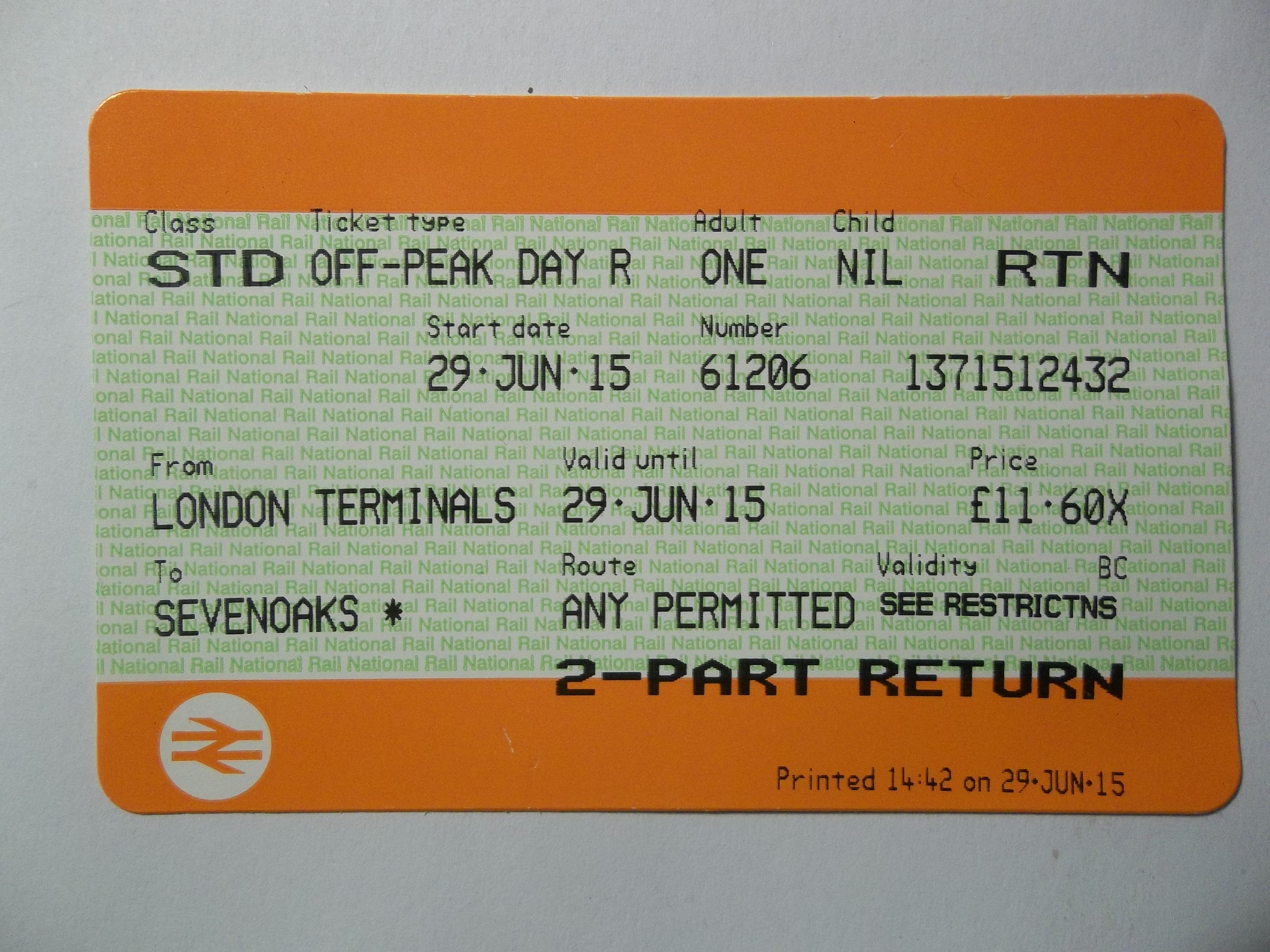
It’s better than than that – they’ve completely bollocksed-up (technical term) the field layout on the ticket so that I have a good few examples of one piece of key information being overwritten by another –

Part of what I do for a living is to do with what’s called user experience design, and I have to say this is one of the poorest bits of design I have seen for a while. When I first saw one of these tickets I nearly threw it away, thinking it was a receipt.
It seems to have been designed with the needs of the ticket inspectors and the ticket machine programmers in mind, rather than the passenger. The hierarchy of information is confused, the line spacing and use of different font sizes unhelpful, and the information displayed is repetitive. The small size of the reservation information fails to recognise the needs of the middle aged, who don’t want to be fishing around for reading glasses while legging it down the platform at Kings Cross.
The Mail had this article in January:
What’s interesting is how much better the design shown in the Mail article is than the one now in use, suggesting that either the design process was not properly followed through, or more likely that rail managers or IT programmers tinkered with the design after it had been approved.
So, the DfT in a report in 2013 called for tickets to be “less confusing”.
It’s hard to fathom out how overprinting the railcard used for the purchase with service validity information achieves that goal.
But, what do I know ?
PS here’s one example ticket I thought was pretty good:
Despite the fact that it’s about 100 years old, you can clearly see the destination, starting point, class of travel, day of issue, class, and railway company.
It seems we have only gone backwards in design terms since then!
Much harder to read – with no discernible advantage at all except, as someone else mentioned, to clear space which could be sold for advertising.
But that’s no advantage to passengers, just to TOCs.
Nigh on impossible to read. Ticket inspector needed to bend right down to check it.
A genuine concern with passenger information would require that the passenger should be left in no doubt as to whether the ticket is valid at the time and and on the route being used.
Horrible design. Have they really no idea? The first time one came out of a machine I thought it had developed a fault.
Buying 2 Senior Returns to London last week produced the new tickets and our response ‘which is OUT and which RETURN?’
So, some Jobsworth, who clearly doesn’t travel using these tickets (Employee Rail pass perhaps?) has ‘improved’ the design. The date, too, is unclear. The month used to be three capital letters, such as JAN. Now it is just one, followed by two small, as Jan, or perhaps Jun or Jul. Will a large print version be available on request? One positive, though, no receipt. Mostly they just added to litter. However, for those who need one, couldn’t the means of payment and last four digits of the credit card number be included on the ticket?